Notes For Assessment

This blog contains all of my notes, research and assignments for The Art of Photography module and is my formal Learning Log.

I have also submitted a portfolio containing example prints of all of my images submitted for each assignment. It also contains the hard copies of each Feedback Report from my Tutor at the end of each section.

Thank You.

Alison Cheshire 512126

Feedback on Assignment 5

On the whole I was very pleased with the feedback for this assignment and my tutor was mostly positive about the project and images submitted. He highlighted a couple of areas that perhaps could have been better and offered some good advice and tips to bear in mind for future projects. These areas were:

  • Lack of directly negotiated portraits.
  • To use a more directive approach in planning and organising the work, such as obtaining a press / photo pass. This would give me more authority and power to control what I wanted to achieve rather than use images that were just chanced upon.
  • When creating photo stories aim to use more of a direct message rather than using a broad generic manner.
  • To use a DTP package rather than word to create magazines / books.

I totally agree with my tutor that I need to be more directive in order to obtain negotiated images. I still find it really hard to approach strangers and ask them to pose for a photograph! Instead I lurk around, observe and anticipate what they are going to do with my finger hovered over the shutter button! Although it is nice to capture candid, natural images of people where they are unaware for some work such as magazine articles and indeed this assignment, it is necessary to engage with the subject. I have just bought a copy of Humans of New York by photographer Brandon Stanton (Stanton, B. 2013. Humans of New York. NY. St Martins Press) It was really interesting to read how Stanton progressed from photographing bridges and buildings then people he found interesting. Eventually he was able to approach people and ask them to pose for him. It is obvious from his images and accompanying texts that his subjects are interested and engaged and this makes his portraits visibly strong. This is something I am going to have to accomplish!

I realise I need to think more carefully about the message I want to get across when doing a “photo story”. My tutor suggested that a different way to do this project would have been to concentrate on one aspect of the event such as the point-to-point component rather than trying to capture everything going on as a “fun day out”.

Finally I have had a look at the Blurb site recommended by my tutor which is a really useful DTP site to create photo books and magazines. I will certainly be using this site for the production of photo books for future assessments.

http://www.blurb.co.uk/


Assignment 5: Narrative

For this final assignment we had to imagine we were to illustrate a story for a magazine! The brief required a cover picture showing some techniques of illustration and 6 – 12 images to be used over several pages inside as a picture essay. Although the brief suggested 3 themes of commodity, light and holidays this was open-ended to any theme with a suitable narrative element.

I decided to base my story on a local, social highlight  – a Point-to-Point which is held annually on Easter Monday. This event is organised by The Old Berkshire Hunt and is a fun family day out attracting crowds from far and wide. Rather than concentrate on one aspect of the day such as the thoroughbred jump racing, I wanted my story to illustrate that the event is an enjoyable day out for all ages and put it together as publicity editorial.

I also wanted to highlight how sociable the event is, bringing together racehorse trainers, jockey’s, farmers, local business, Old Berkshire Hunt, bookmakers and spectators of all ages including family dogs! As point-to-pointing is lower key than racing, there are no special passes to race enclosures or hospitality areas, everybody mixes together and the atmosphere is sporting and enjoyable with lots of merriment  from well packed picnics and full hip flasks!

I have been to the event many times over the years so knew what to expect with regards to the layout, best places to spectate and take pictures etc. It is also the perfect place to people watch and I am always fascinated with the amount of dogs that go as part of the family day out.

With this in mind, I made a list of all the images I wanted to take and include in my picture essay as follows:

  • Old Berkshire Hunt / Master & Hounds
  • Location shots / crowds
  • Horses – before / during /after races
  • People – Jockey / Trainers / Spectators / children / dogs
  • Atmosphere – family fun

With past experience, Easter Monday is usually sunny and warm or bitterly cold with wind and rain! luckily this year it was the first really warm day of the year requiring suncream and shades which made the task of shooting these images a lot easier! I took well over 500 images over the course of the day and narrowed this down to a shortlist of 61 and then down to the final 15. The images I decided to use are as follows:

The hardest part wasn’t in choosing which images to use but in which order to place them and how to display them. I wanted each different aspect of the point-to-point to be displayed in different pictures but also wanted a set that sat well together and provided a sequence of things happening (but not necessarily in order).

Looking at the work other students had done, I noticed some had used specific software or publisher to produce a really classy mock-up of a magazine. I have zero knowledge in this area so decided to put mine together in a basic word document. The brief didnt require text, but I wanted to include some background information on how point-to-pointing has evolved over the past 140 years, the Lockinge course and how atmospheric these events are and link this in with my images. I lifted some text from the following websites to use alongside my picture essay and make the feel of a magazine article more authentic.

The Old Berkshire Hunt

Country Life Magazine

The final result can be seen by clicking on the link below:

lockinge2

I didn’t find it too hard choosing which images to use with the accompanying text, but I hadn’t completely thought through that the size of image I could use would be limited to the space available on the page with the text! For example on the day of the point my only concern was anticipating what was going to happen through quick observation and composing my images quickly to illustrate the events as they happened. It wasn’t until afterwards I realised about 99% of the images I had taken were landscape orientation. Therefore, choosing images to fit a portrait space were limited to just a few.

Although I had taken a selection of lenses on the day, the only one I used was my 18 – 280 mm lens. This was perfect to be able to zoom in and get close-ups quickly as well as compose distance shots and I was able to choose from images with different focal lengths providing visual interest within my photo essay.

The assignment brief asked us to include a technique of illustration covered in Part five for the front cover. I used the image below not only because it was vertical and would enlarge in the right proportion to fit on an A4 magazine cover but also it is an illustration by juxtaposition.

Old Berkshire Huntsman

Old Berkshire Huntsman

The huntsman with his red jacket is a symbol or sign of a high-ranking rider with authority in a hunt. Most people would associate this sight with the countryside, seeing the horses galloping across a field or jumping a hedge. In this image, horse and rider are out of context with the field of parked cars and numerous people in the background suggesting to the viewer that there is something else happening as opposed to a hunt. Combining these two elements together emphasises the juxtaposition and piques the interest of the viewer prompting them to open the magazine and find out more.


Similarly,the next image is a scene of the point-to-point  but why is there a London double-decker bus destined for Oxford Circus parked in the middle? The reason – it was hired to transport a large party to the event and wouldn’t have made it uphill across a field to park, so was left there! The juxtaposition of these two elements emphasises the event as an attraction where people travel from far and wide for an enjoyable day out, have a drink and let their hair down!

Setting the scene

Setting the scene

This image is also what is known as The Establishing Image it sets the scene to place the event in context of the environment – rolling green hills and countryside. Taken from a higher vantage point it sets the stage for the rest of the story and I used it at the beginning of the article.


The following 10 pictures come under the category of Action Image. Categorically these are shots familiar to what is seen by the naked eye – not too close and not too distant, but enough to illustrate the action or interaction of the people or place that the narrative is about.

The Portrait Image was the category that I struggled with most as I am just not confident enough to walk up to strangers and ask if I can take their picture I I did however manage to capture the following image of the huntsman on his horse. Standing on the ground at a lower vantage point I was able to zoom in and use the bright blue sky as the background. I think the fact he is not looking directly at the camera and the diagonal line of  shade from the peak of his hat helps to emphasis that he is on horseback and connects him in the environmental context.

Master of the Hounds

Master of the Hounds


I took many shots of the hounds and their antics. The sport they are associated with portrays them as vicious and brutal. I was amazed at how docile and well-behaved they actually were. They have been trained to a very high level and obeyed every single command given by the Master’s who incidently knew every single dog by their pet name and there must have been approx 30 in this particular pack.! The docile nature and good behaviour of the dogs was evident when they mingled with the crowds and responded lovingly to any fuss given. I particularly like this image as the nearest hound is looking expectantly at me, emphasising the connection they have with humans as well as being an established part of the pack.

Old Berkshire foxhounds

Old Berkshire foxhounds


For the final category of Close-up / Detail Image I managed to zoom in on my husbands hands as he was tucking his betting slip into his wallet. I don’t particularly like the image as I think it looks too staged but it does bring the betting element into the story and emphasises the sporting atmosphere of the day.

Betting slip

Betting slip


Self Assessment

Demonstration of Technical and Visual Skills

I really enjoyed doing this final assignment – it was a great opportunity to put all the compositional techniques that I have learnt over the duration of the course into practice. Documentary photography has always been a favourite genre for me and I love the challenge of going out to find interesting subjects. Having an awareness of what is going on around me has developed my observational skills and instinctively I can now anticipate what is going to happen and react quickly enough to capture interesting images.

Quality of Outcome

I have learnt throughout the course that there is so much to think about when putting together a final set of images. It is not just about taking well composed photographs – it is about taking an idea and growing it throughout the course of an assignment and bringing lots of different elements together in order to produce an informative and quality set of images that will have an impact on the viewer. I have learnt not to rush out and take any old image but to sketch out the idea beforehand, plan a theme, research similar work and have an idea how I want the end result to look. This has helped to make me more productive, cutting down the amount of times I have to go out and take pictures and not taking so many random shots that take time to edit out after.

Demonstration of Creativity

AOP has really opened my eyes to the work of other photographers. Researching other work has made me think a lot more about the context of images and how this is perceived by the viewer. I have just received the coursework for my next module, Context and Narrative and already am buzzing with ideas. AOP has given me the confidence to think outside the box and I’m really looking forward to experimenting with these ideas in order to produce original images that develop my personal voice.

Context

WordPress and blogging was the bane of my life when I first started this course. It has been a huge learning curve creating a virtual learning log as opposed to handwriting a hardcopy. Perseverence paid off though as I’m quite proud of the end results and comments about how easy it is to navigate. I still find it hard to write my thoughts and ideas in a critical way but have learnt to keep a notebook handy and write these down as they occur. This makes it much easier when it comes to writing up exercises and assignments. I have also learnt the hard way that when visiting exhibitions and going to study visits, I should write these up within a week whilstt everything is fresh in my mind. Otherwise the longer it is put off the more of a chore it feels, which does take the edge off the enjoyment gained from visiting these events.


Photographer Research – Richard Billingham

All images used in this post are copyrighted to the individual photographer stated and are only being used for educational purposes.

In the feedback from my last assignment, my tutor suggested I look at the book Ray’s a laugh by Richard Billingham.

Billingham, R (2000) Ray’s a laugh. Berlin. Scalo

When I picked the book up from the library I had no idea who Richard Billingham was or what Ray’s a laugh was about. Later that evening when I started to turn the pages, I became gripped by a sudden fear of what horror I might find on the next page, but fascination and the compulsion to carry on consumed me. The only way I can describe this feeling was like an urge to scratch a scab, knowing that after a brief moment of relief the itch would be twice as bad but you just cant stop yourself!

There is no text in the book, but none is needed as the pictures speak for themselves: a narrative of poverty, violence, tragedy, pain, addiction and just plain hopelessness. The amateurish way the pictures have been taken are a testament to the shocking reality that these are real life pictures. The images are clearly not staged with kitsch props and there is no post production manipulation. They are basic, pure and honest – truthfully revealing the life and events of this family. There is no room for a viewer to interpret the  images any differently from the hellish truth of what they are.

It is hard therefore to believe that Billingham naively snapped these images without any consideration to their worth as expressive, photographic art. It was his intention to use these pictures to make sketches for paintings of his family (at the time Billingham was studying Fine Art at Sutherland Art College).

When you get to the back of the book you can read some of Richard’s own words:

“This book is about my close family, My father Raymond is a chronic alcoholic. He doesn’t like going outside and mostly drinks homebrew. My mother Elizabeth hardly drinks but she does smoke a lot. She likes pets and things that are decorative. They married in 1970 and I was born soon after. My younger brother Jason was taken into care when he was 11 but is now back with Ray and Liz again. Recently he has become a father. Ray says Jason is unruly. Jason says Ray’s a laugh but doesn’t want to be like him”.

One of the  first images in the book is of Ray and Liz in what looks like a fairly clean and tidy lounge. In a way this sets the scene for what is to become the chaotic, snapshot story of their life.

ray1  Copyright Richard Billingham

A newspaper is neatly folded on the stool, the carpet is visible and  the room is devoid of mangy cats and dogs. Liz is clearly going out – coat on, fag in hand and bag over-arm. Ray is already absent, long-gone staring longingly at the  bottle of homebrew and two beer-stained glasses on the table. You know the minute Liz steps out the door, that bottle will be emptied and chaos will ensue.

The hardship and ordeal of living with a family member who has chronic alcoholism becomes evident with the turn of each page. Domestic violence that is alcohol related  is normally delivered by the drunk themselves. These images tell us that Liz is no shrinking violet when it comes to confronting her intoxicated husband. A couple of the images clearly show Liz in a dominant stance, fists clenched, ready to physically deliver her anger and frustrations whilst Ray in his debilitated state does his best to deflect the abuse.

ray2ray3


Copyright Richard Billingham

Despite everything, there is evidence of love between the couple. The photo below shows Liz handing Ray a tissue for his bloodied eye post-fight and another in the book shows a rate intimate moment of the couple happily embracing.

ray4  Copyright Richard Billingham

Viewing Billingham’s work, I did think there is a similarity to Martin Parr’s work. ‘In think of EnglandParr displays images of a similar content (for example food) in a montage across two pages. Although the picture below is a double page spread, it shows Liz on what looks like a good day. Her hair is fresh and she is wearing make-up – eyeshadow, eye-liner and lipstick. Behind her is a wall full of decorative masks, heavily painted linking Liz’s love of pretty things and her unusually made-up face.

ray5  Copyright Richard Billingham

Parr also displays people captured in unattractive poses next to a related image of something tacky in order to portray the subject in a satirical way. In the next image, Liz’s feet in manky fluffy slippers stand next to the manky dog with his neglected overgrown claws due to confinement in a flat. This would actually be quite funny if it wasnt so shockingly true. the dog desperately licks the spilt sugar from the floor as if his life depends on this only nourishment. The red-eye exacerbates the stir-crazy feeling portrayed by the dog, in its life incarcerated in a flat with mangy cats, a rat and an alcoholic. In many of the images the animals appear to view Ray with disdain and disgust and you get the impression they view Ray from a position of superiority.

ray6ray7

Copyright Richard Billingham

In her book ‘The Photograph as contemporary art’, Charlotte Cotton looks at how narratives of domestic and intimate life have been presented in contemporary art photography. She talks about how a normal family album usually consists of snapshots taken by a non-photographer member of the family. They are displayed in an album including the ones with red-eye, a finger over the lens or partially blurred and quotes:

“Ultimately these are not the criteria by which such photographs succeed or fail for us. What is important is the presence of loved ones at a significant event or moment that prompted the taking of the image”.

Cotton, C (2009) the photograph as contemporary art. London. Thames & Hudson

For many art photographers shooting intimate subjects, these technical mistakes are used intentionally to signal that the photographer had a relaxed and intimate relationship with the subject. It is interesting therefore that Billingham captured these family snapshots without the intention of putting them in an album but to use later to make sketches for his paintings. Obviously he is a trusted member of the family – I wonder if Ray and Liz were even aware of him taking these photos and would they have behaved differently if a stranger was the photographer?

In the violent images, Billingham’s brother Jason hovers at the edge of the frame – we glimpse an arm or a leg and I wonder what his presence meant? Did he instigate the fights between Ray and Liz – goad them and cheer them on or was he acting as a referee trying to mediate peace between the sparring couple? Either way Billingham as the unseen observer gives us a behind-closed-doors snapshot of the intimate life of his family. His family album unlike thousands of others that have been edited to evoke happy memories in years to come, provides a truthful narrative of poverty and alcoholism. The visiting examiner / newspaper editor who visited Billingham’s Art College was definitely right to persuade him to use the photographs rather than his paintings as the best expression of his family.

Sources

Billingham, R (2000) Ray’s a laugh. Berlin. Scalo

Cotton, C (2009) the photograph as contemporary art. London. Thames & Hudson


Memory Exhibition – Study Visit 6th June 2015

I was really interested to attend this visit not only because I live in Oxford and wouldn’t have to make the trek to London, but also the hospital venue was the same environment as an exhibition I was involved in at Oxford several years ago. I was intrigued to find out how the group of Level 3 OCA students collaborated their ideas and work and how the exhibition space was acquired in order that I could compare it to my experience. It is also lovely to view the work of fellow students albeit at a higher level, to gain an insight and understanding of their ideas as well as get an idea of the standard of work required at that level.

The idea of the Memory Exhibition came from student John Umney who volunteers with arts and health charity Artscape at the Nuffield Orthopaedic Centre in Oxford. The Project Manager for Artscape – Tom Cox offered John the free art-space to exhibit photographic images. Opening this opportunity up to OCA Level 3 students, John asked fellow student Penny Watson to collaborate with him on the project resulting in 7 views by 7 photographers totalling 49 images in the exhibition.

The theme of “Memory” was chosen because of its openness to interpretation. In an article in The Oxford Times, Thursday 11th June 2015 , John Said:

“The work we are showing is about that most fallible of human functions – memory. The images are diverse, dealing with the very personal to the corporate. We have interpreted the theme of memory in different ways.”

http://www.oxfordtimes.co.uk/leisure/focus/13327173.For_Art_s_Sake_with_John_Umney/

The photographs in Memory are all of the past but are evidence of a moment in time  in a visual form. They are all individual narratives experienced or produced by the individual photographers, but what the viewer see’s is a narrative that reflects their own experiences evoking personal memories.

The work featured in this exhibition was by:

Mike Cookson – Recollective

The weight of memory through casually captured selfies and “we were there” photos, to more reflective images recording tragedies and remembrances to war and bloodshed.

Keith Greenough – Lifting the curtain

Fascinated by East London and how it has been shaped by history, Keith used text from Charles Booth’s 1889 sociocultural survey – Life and Labour of the People. Re-visiting the areas, Keith photographed the sites described as they are today which juxtapose the texts written in 1889 describing what was witnessed in these areas at that time.

Keith was at the study visit and it was delightful to talk with him about how the project started, how he researched the sites using Google Earth and the trials of shooting the images at night to eliminate any modern people. So many times I have visited exhibitions and wished I could talk to the artist in person about their motives and working practice so it was a real treat having Keith there.

John Umney – Are you still there?

Images taken by the emotional response to light accompanied by un-related words or text that were written by the artist or to him from others. Thought provoking – requiring the viewer to make up their own narrative and realising that images like words can mean one thing one day and something totally different the next.

Sue Jones – Remembering I’m ill

Suffering with ME resulting in crippling fatigue and memory problems, Sue has portrayed herself in various guises pre illness and in others where activities render her housebound.

Penny Watson – Eudosia

An exploration of the relationship between children and their landscape. Foraging for foliage and the connection with nature returning childhood memories.

Margaret Taylor – Vandals or memories

A series of trees with carved graffiti questioning whether people leave their marks on trees as vandals or with the desire to be remembered and render themselves immortal?

Mirjam Bollag Dondi – along the frozen valley

Beautiful collection of frozen water and riverscapes with the heart wrenching narrative of mourning and memories that we all have or will experience:

We used to hike along the frozen river… But now you left – to live in the land of not remembering – and so I walk alone

The full exhibition brochure containing further information on each body of work can be accessed below.

Click to access z-final-exhibition-brochure-27-april.pdf

The exhibition I was involved in was part of a group (5 students and 1 tutor) on an advanced adult learning photography course. We thought it would be good experience to hold an exhibition of our work as part of Oxfordshire Art Weeks. The space for our exhibition was also a hospital venue – the John Radcliffe, Oxford and was acquired by a fellow student who had previously expressed an interest in using the space and was awarded it on a lottery basis.

The first difference I noticed was how professional the art space for the Memory exhibition looked. Not only did it extend through different parts of the hospital but offered a professional hanging rail making the final display look really slick.  In contrast our exhibition space  was one long wall in the main corridor on the ground floor of the hospital. The wall was really tatty – bearing scars of old posters, drawing pins and holes from old picture hooks. To spruce this up we invested in a long roll of white sheeting, which we nailed along the wall to provide a pristine background!!

I can see the advantages and disadvantages of the space in both venues. In ours the 6 bodies of work were displayed together giving viewers the opportunity to see the whole exhibition as they walked along the corridor. Whilst this had visual impact on the viewer seeing the work grouped together, for somebody not stopping to ponder or read whilst walking by, the identities of us as photographers were less obvious as the bodies of work would appear blended as one.

However, with the layout of Memory, I felt there was a danger that people would only see part of the exhibition depending on which part of the hospital they worked or visited, especially as there were no leaflets for people to read, indicating the exhibition continued elsewhere. On the other hand separating the work with different areas or using doors in the walls to act as break points, I felt viewers of Memory would be better able to focus on an individual photographer one at a time thus allowing them to appreciate the work and not be distracted by other pictures displayed right next to them.

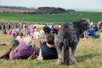
Another big difference was the theme of the exhibitions. As a group of photographers, we called ourselves “Shooting Stars”and each bought a different genre of photography of unrelated themes: fine art pictures of flowers, landscapes of glaciers in Alaska, portraits of different women named Juliet, documentary about the meaning of tattoos, abstract – reflections of colour in the river and lifestyle – people and dogs on beaches. Memory however, consisted of seven different interpretations of the word and what it meant to the photographer as an individual. I can’t help wondering whether Memory would have been better suited to my long corridor wall so the theme could run together in one place and whether our work would have been better suited in separate areas? Neither would be right or wrong, but it’s food for thought and made me think how important it is to give careful consideration to the placement of each image when planning an exhibition, ensuring viewers get maximum impact and the space to appreciate the image for what it is and interpret it accordingly.

This brings me on to the widely discussed topic throughout the study visit – environmental context.  Generally people passing through a hospital are staff, visitors and patients and it was interesting to listen to both Tom Cox (Artscape Project Manager) and John Umney talk about the benefits that creative art can bring to health and well-being.

In the Oxford Times article mentioned above, John said:

“At a simple level, the arts in hospitals provide a distraction for patients and visitors, creating space for reflection. but there’s growing evidence of the positive impact of the arts on health and well-being, both in physical and mental health. The arts can enhance recovery, improve quality of life (particularly for patients with long-term, terminal conditions) humanise healthcare environments for patients and staff and contribute to cost savings through shorter hospital stays and reduced medication”.

http://www.oxfordtimes.co.uk/leisure/focus/13327173.For_Art_s_Sake_with_John_Umney/

It was quite a surprise therefore that ‘Remembering I’m Ill’ – the work of student Sue Jones had received several complaints from members of the public. The self portraits of Sue illustrating her battle with the debilitating illness of ME causing chronic fatigue, memory loss and concentration problems were likened to actual or intentional suicide by several people. Despite providing a written account of her illness, symptoms, coping methods and intentions with the work that accompanied the exhibited images the hospital decided to remove the work because of the distress caused.

There was quite a discussion about the difference in context of artspace in a hospital compared to artspace in an independent gallery. It also highlighted the fact that once an image leaves the hands of the photographer it can take on a life of its own and is open to many individual interpretations. The environmental context is certainly something to be considered quite carefully by anybody planning the organisation of an exhibition.

With regards to the organisation of the exhibition I was extremely impressed with the way Jon and Penny collaborated to bring this show together with such high standards, especially given the distance between them in terms of miles as well as the other students.

Choosing the work to include in the show must have been incredibly difficult especially notifying the unsuccessful artists. For us – we sat round a dining room table as a group , viewed each body of work and then decided as a group the images to use from each photographer.

I admire John for taking on the onerous task of framing each image in the exhibition and envy the professional hanging system they were able to use. It took me an entire weekend to mount my images and then screw plates each side of the frame (for fixing them to a wall)  It then took another whole weekend to screw the frames onto the exhibition wall using a tape measure and spirit level, perched on a ladder with a whole load of cursing and choice language!! In terms of framing we also used uniform frames to ensure consistency and continuity but used 3 different sizes of A3, A4 and A5 (aperture size) to display images in aesthetically pleasing groups. I did find the 20 x 16 ” size stipulation for the Memory exhibition resulted in a rather flat or monotonous look but do appreciate the space constrictions of the artspace they had available.

In my experience I found 6 strong-willed people organising an exhibition too much and the dynamics of leadership changed continuously with disagreements and undercurrents of resentment when people were thought not to be pulling their weight. Having two people curating an exhibition makes much better sense although I know John and Penny had their own frustrations too.

The question of why  Memory didn’t have a private view was raised and John said as a hospital and working environment there was nowhere a private view could be held unobtrusively.  I did sympathise with this since the artspace was split over two levels and on different corridors. Fortunately for us – the main corridor containing our artspace at the John Radcliffe was situated next to the cafeteria run by the hospital’s League of Friends. We held our private (but not so private view) on a Sunday afternoon between 2.00 -4.00 pm when the hospital would be very quiet. On the invite we encouraged people to use the cafeteria for refreshments whilst discussing and reflecting upon the exhibition thus benefitting the hospital charity. (We did let the cafeteria know in advance who got in an extra volunteer and baked extra cakes for the occasion!)

It was also mentioned that the hospital had not advertised the Memory exhibition and there was no signage indicating a photographic exhibition extended through the building. Maybe this is the price to pay for getting free exhibition space or indeed using a hospital as a venue? Fortunately for us the fee we paid to take part in Oxfordshire Art Weeks included publicity in the event brochure and we were supplied with some Art Weeks banners. We also had the luxury of all living locally so we had time to put up lots of posters and handed out flyers to family, friends and colleagues. Many of these people did visit the exhibition over the 4 week duration whether it was to visit a patient or hospital appointment or solely to view the exhibition. All the comments that were emailed to us individually we collated so we could each keep a copy at the end.

Gaining space to exhibit any type of art for free is extremely rare so it is wonderful that health charities such as Artscape offer this opportunity. Not only does it have a  positive effect on people receiving long-term healthcare programmes, but it gives students or artists who are unable to afford gallery space the opportunity to show their work.

I do remember feeling “I am never going to do this again” when my pictures were finally hung and on display, but of course I will – as the positive comments and appreciation from viewers far out-weigh the hard work, blood, sweat and tears!!

For the very first public exhibition of OCA student work organised by students themselves, I would like to congratulate John and Penny for a job extremely well done! The whole exhibition including the layout, framing, presentation, brochure and of course the individual student work was done to a particularly high standard. You should be very proud of yourselves and have certainly set the bar high for all of us fellow students following on behind you!


Deutsche Borse 2015 Photography Prize

Last month I managed to pop into The Photographers’ Gallery to view the Deutsche Borse Photography Prize, a couple of days before the exhibition closed. This annual prize of £30,000 rewards a living photographer for a specific body of work in an exhibition or publication format within Europe, which has significantly contributed to Photography. The shortlisted photographers this year were:

  • Nikolai Bakharev (b. 1946 Russia) Relationship
  • Viviane Sassen (b.1972 The Netherlands) Umbra
  • Zanele Muholi (b.1972 South Africa) Faces & Phases 2006 – 2014
  • Mikhaell Subotzky & Patrick Waterhouse (b. 1981 south Africa & b. 1981 UK) Ponte City

All four bodies of work were extremely strong, however the winner of this years 2015 prize went to Subotzky & Waterhouse for their publication Ponte City (Steidl / Walther Collection, 2014).

Nikolai Bakharev – Relationship

At the age of 24 Bakharev became a photographer – a profession in 1970’s Russia that was considered to be on the same par as manual labour. As a way of earning money to support his personal work, Bakharev started photographing people on public beaches even though sexuality and had been heavily censored in the country since the mid 1930’s.

The resulting images although carefully composed, capture the subjects in moments of  intimate happiness. The open and honest expressions are full of warmth considering that producing such images at this time was prohibited.

The message from this work proved the strength of human bonding and relationships essential to our existence. By being restrained to freely explore his own artistic interests, Bakharav avoided the political and social restrictions by actively capturing private moments in public spaces – a real juxtaposition of ideals!

Viviane Sassen – Umbra

Although abstract work is not my thing, some of the pictures in this exhibition were really striking. Umbra is the latin word for ‘Shadow’. Using vivid colours, contrasts and textures, and light and shade, Sassen uses a dynamic and experimental approach to produce her pictures. the final result is a combination of photography with other media including collages, drawings and video with poems composed by Maria Barnes. The work is an expression of the human psyche and fear, with the word “shadow” making a connection to the alter ego. There is also evidence of both realism and abstraction within Sassen’s work.

Zanele Muholi – Faces & Phases 2006 – 14

I loved this work! Taken from her book Faces and Phases (Muholi, Z. 2014. Faces and Phases. Germany. Steidl) the stunning display of black and white portraits of black lesbians and trans men consumed an entire wall in the gallery. Muholi’s portrait pictures offer an insight into the identity of black lesbian and gay communities in post-apartheid South Africa. The images taken between 2006 – 2014 along with personal stories written by the participants provide a narrative of individual joys, hopes, longings, scars, suffering and endless love. At a time when African leaders criminalised lesbian and gay sexuality by publicly projecting hate speeches often resulting in the curative rape of black gay women, Muholi resisted this oppressive power by encouraging her participants to simply live their lives and come out and be seen. Although putting herself and the subjects at risk, Muholi describes her photography as a therapy – paving the way for others to come out and understand that they are not alone. By uniformly exhibiting the 56 portraits in rows and columns  this message is loud and clear. The message for the viewer is that they are bold, black, beautiful / handsome, proud individuals.

20150604_115750What was particularly nice about the exhibition was comments and statements from the South African participants were handwritten on a white sheet to accompany the portraits. Local British people from the queer community had been invited to do the writing – an international show of solidarity.

20150604_115812


Mikhael Subotzky & Patrick Waterhouse – Ponte City

The collaborative project by Subotzky and Waterhouse is a visual and written exploration of the 54 storey high-rise building Ponte City in Johannesburg.  Built for the white elite under apartheid and white supremacy in 1976, the building had fallen into a state of disrepair and became a refuge for immigrants, dealers and criminals. Although developers bought the building in 2007 and began a process of eviction, the plans for refurbishment were never completed. The project started in 2008 and working with remaining residents combines archival and found material including pamphlets, essays, architectural plans and photographs.

What I found particularly interesting was the layout and presentation of the exhibition. As a viewer it provided a great insight into the context in which recent inhabitants of Ponte lived, suggesting a surreal world of nightmares and badness. The most impressive part  of the exhibition were the two-floor to ceiling lightboxes showing windows, doors and TV’s from each apartment. The deadpan and repetitive images presented this way, really highlight the sheer size and scale of the building . Photographs found in abandoned Ponte city apartments had been cleverly pinned over enlarged photographs of the rooms in which they were found or the spaces they depict, again engaging the viewer and providing an insight into a way of life.  Overall the mix of written material, personal stories, collages of found material  and photographs made a stunning exhibition and winner of the 2015 prize richly deserved.

20150604_115514 20150604_115600 20150604_115637


Exercise: Rain

Object

  • Produce 1 photograph to be used as a magazine cover on the subject of rain.

Exercise

Rain is something we are all too over familiar with – How can you make rain look attractive and interesting? This exercise was harder to do than I thought.

I got caught in a downpour in London. It was just beginning to get dark and a combination of rainwater and light was producing amazing reflections on the pavements. I knew I had to do this exercise so I gave up trying to keep dry, put my umbrella away, got out my camera and fired off lots of shots of the pavement as I was walking along the bridge towards The Houses of Parliament. When I got home and uploaded the pictures I was really attracted to the following image because of the angle it had been taken producing diagonal lines. I think it looks even better presented upside down., where the reflection of the person appears to be walking along the diagonal line. At first glance it is obvious it is a rainy picture of big Ben but the fact its upside down makes the viewer look harder and is more interesting.

IMG_9400


Exercise: Juxtaposition

Object

  • Take any book and make a suitable cover illustration using two or three relevant elements.

Exercise

One of my friends is a frequent traveller and is always snapping pictures of lost shoes wherever she goes! It started off as a bit of a joke but now she has become obsessive and frequently adds pictures taken on her camera phone to the album “Lost and lonely footwear” on her Facebook page.

I recently came across this pair of shoes – not just the one but a pair!

IMG_1338aThey had been abandoned underneath a tree in a busy street. I was fascinated in the way they had been left – almost as if the owner had been lifted up out of his shoes from a standing position. Obviously they reminded me of my friend so I took the picture and sent it off to her wondering how you can lose a “pair” of shoes? One shoe is relatively plausible but to lose a pair and for them to be left in such a way under a tree is just weird!


I have just finished reading A Place Called Here by Cecilia Ahern (Ahern, C (2006). A place called here. London. Harper Collins.) It reads rather like a fairy tale about a woman who is obsessed with finding missing things. It started as a child when socks went into the wash as a pair but only one would come out at the end and then a girl went missing from her class . Her obsession to find missing things grows and she dedicates her life to finding missing people by first joining the police force and then becoming a private investigator. One day she slips through the ether into another world which is the place all the missing people go to. She discovers the missing people she has been searching for years and learns how they are living in the place called “Here”. Not only that, everything that has ever been lost including shoes arrive “Here”!! Once all her questions have been answered she then starts a search to find her way home.

The book had more than a touch of fairytale about it – when I got to the end I really wanted “A place called Here” to be real and all the way through kept thinking about all the odd shoes that can be seen on any pavement in any city around the world. Every old trainer I now see sitting in the middle of a main road, I question who the owner was, where have they gone and how that shoe came to be lost?!

I think this picture would be a perfect cover for the book. The title of the book is about a place and the story is about missing people. and lost items. The picture of the shoes suggest that they are lost (in a place under a tree) but also connects with the story line  of missing people making the viewer curious about where the owner of these shoes has disappeared to.


Exercise: Symbols

No photos are required for this exercise – merely an opportunity to think or brainstorm some ideas about photographic illustration with the use of symbols.

The course notes discuss the use of clichés and to be wary of using a symbol that has previously been over used. unless it can be done in a totally original way. A symbol should also be recognisable in order for it to have impact. It may have two different meanings or could be presented in stages.

We were asked to think about the following subjects and list symbols  that could be used in photography to illustrate them:

Growth, excess, crime, silence and poverty.

Growth – growing; increase; something grown or growing; tumour 

  • Pregnancy – the growth of life
  • Seedlings – growing into plants / trees
  • City landscapes developing over time
  • Money – accumulation
  • Personal – ideas, personal development, education, pathways

Excess – State or act of exceeding the permitted limits; immoderate amount; amount by which a thing exceeds the permitted limits

  • Greed – overweight, money, wealth
  • Alcohol – drunk, driving
  • Stock piles of subjects for eg food
  • Baggage

Crime – Unlawful act; unlawful acts collectively

  • Theft – burglary,
  • Crime Scene – police tape, outline of body, finger prints, guns, knives etc
  • Prison cell – bars, hand cuffs,
  • Courtroom – judge, gavel

Silence – Absence of noise or speech; make silent; put a stop to

  • Empty – no people – beach, mountain, calm and serene
  • Finger against lips – gag, tape zip
  • Hands over ears
  • Ears and hearing aid
  • Feather dropping
  • Sleeping baby
  • Machinery – eg oil to make it quiet

Poverty – State of being without enough or money; lack of; scarcity

  • Money – empty pockets, bank account, purse with a few coins
  • Food – empty bowl, hungry people, empty tummy, bare field
  • Water – empty well. dry river
  • Homeless person
  • Empty hands

Exercise: Evidence of action

Object

  • Produce 1 photo in which it can be seen that something has happened. Include something that has either been emptied or broken.

Exercise

Sadly this Grade II listed thatched cottage caught fire last November. I walk past it on an almost daily basis with my dog and was so shocked to see it burnt out the day after the event. Thankfully the owner escaped with only 1 severe burn as the fire spread incredibly quickly. The upper floor was totally destroyed and the ground floor gutted. It was caused by an electrical fault.

With this exercise in mind I took the following pictures:

1 IMG_7528 IMG_7537 IMG_7546 IMG_7549

When I took the photographs I thought it would be relatively easy to choose one which illustrated the evidence of action, empty and broken – but they all do!! I tried to be objective by putting myself in the viewers shoes and thinking which picture best tells me that this property was gutted by fire due to an electrical fault? In the end I decided on this picture:

IMG_7537It is quite abstract, but on closer inspection the viewer can see the light switch in the corner of a room. Fire has destroyed the upper part of the room revealing the sky and all that remains is charred wood and scarred bricks. Ironically the only part of the image that remains is the light switch and electrical cables which were the cause of the fire.